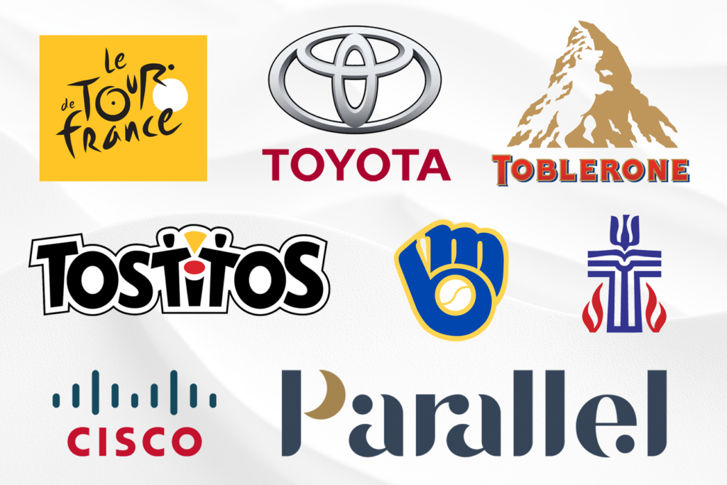
Ever notice how the old Milwaukee Brewers logo isn’t just a ball and glove?
Look closer: It’s an ‘m’ and ‘b’ cleverly combined into baseball gear. Once you see it, you never unsee it.
Great logos often hide clever details that reward closer inspection. Some are intentional brand storytelling. Others might be happy accidents that stuck.
Toblerone‘s mountain isn’t just any peak — It’s Switzerland’s Matterhorn. And there’s a bear hidden in it. That’s no random choice. The bear is the symbol of Bern, Switzerland, where the chocolate was born. I love it, and was sad when I learned that Toblerone lost the right to use the peak, because it has become a “Made in Switzerland” trademark, which was originally the case. No longer, as the product is now made in less costly Slovenia.
The Tour de France logo contains a cyclist and bike, formed entirely from letters. The ‘R’ in ‘Tour’ forms the rider, while the ‘O’ and ‘U’ create the wheel. Pure French design elegance — although not sure I’d want to spend much time on that saddle.
Tostitos‘ logo has two people sharing chips and salsa hidden in the middle letters. It’s a clever design that reinforces their whole “bringing people together” message.
Although I may be slightly biased, my favorite logo easter egg is Parallel Sleep‘s little crescent moon. (Kudos to Graphos Product creative Director Derek Anton for his genius work on it.) It’s subtle, beautiful and un-unseeable once you’ve noticed it. The connectivity between the other type elements speak to how inextricable our sleep quality is from our health, happiness and productivity.
Hidden elements like these serve different purposes:
- Some root the brand in place (Cisco‘s stripes echo the Golden Gate Bridge. I can’t tell you why they don’t swap the red and blue)
- Some add layers of meaning (the Presbyterian Church logo contains FIVE distinct theological symbols)
- Some just make you smile when you spot them, like Goodwill‘s happy face in a G
Your tank brain feasts on these discoveries. They create little moments of delight that make you feel smart and strengthen brand connection.
Action for today: Look at your logo through fresh eyes. What story does it tell beyond the obvious? Sometimes the meaning you think is clear needs to be discovered to be remembered.
Want to explore your brand’s hidden potential? Time to revise the logo you have? Let’s talk about visual storytelling — tap reply and tell me your thoughts. Got a favorite logo to share? Do the same!
Laurier
Product Payoff: Look closely at Toyota‘s three overlapping ovals in the image above — they contain EVERY letter of the company name. When Toyota revealed this in its brand guidelines, even longtime fans were surprised. The logo had been hiding this secret in plain sight since 1989, proving that sometimes the biggest joy of a secret is in savouring it yourself.
