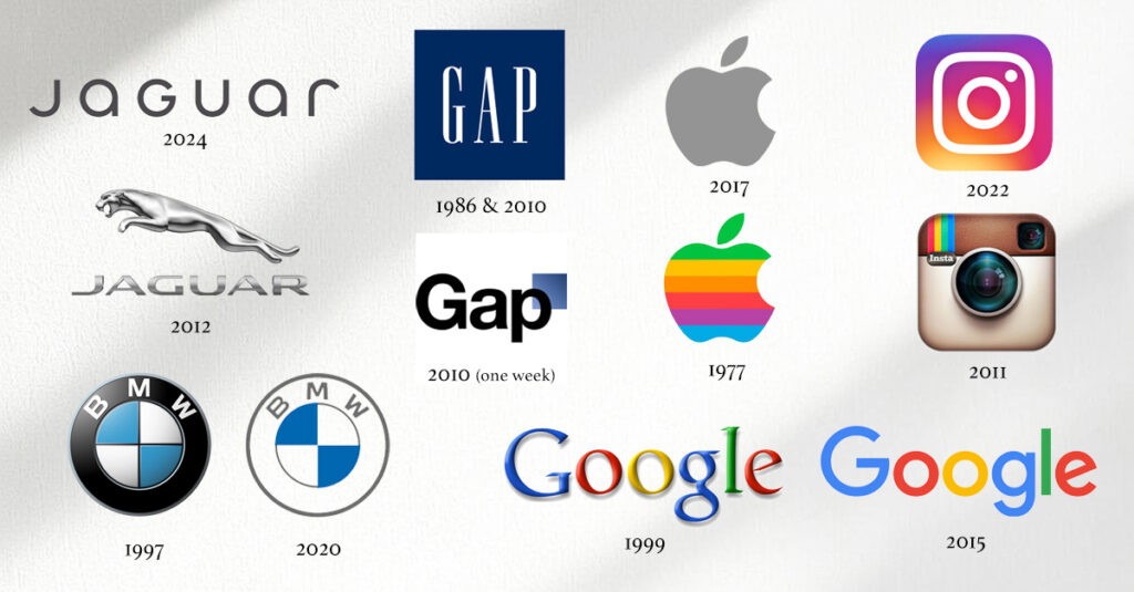
Jaguar’s recent transformation of its leaping cat into a simplified fashion font is only the latest in a long line of controversial rebrands.
Social media erupts.
Design blogs savage.
Loyal customers mourn.
The popcorn gallery moves on. 🍿
But here’s what IS interesting: This “disaster” might be exactly what Jaguar needed to be reborn as a luxury EV brand.
Jag hasn’t been so relevant in … probably ever.
And now, everyone is curious to see the the actual cars roll out. I know I am.
Think back to some other controversial rebrands:
- Gap‘s 2010 logo change lasted one week after public torching
- Instagram‘s 2022 shift to a generic gradient drew massive hate
- Google‘s 2015 sans-serif switch was called “childish”
Yet most of today’s teenagers won’t even remember the old Google logo.
Instagram’s users didn’t leave.
Only Gap reversed course.
Smart CMOs understand something crucial about logo changes: Initial hate doesn’t always mean lasting rejection or long-term failure.
BMW simplified its logo in 2020. Porsche refined its crest in 2023.
Both faced backlash. Both carried on, and won new customers.
Because brand marks have jobs that didn’t EXIST before:
- Social profile pics
- App icons Favicons
- Video motion graphics
- AR/VR environments
The leaping Jaguar that looked so bloody magnificent on a hood ornament might fail as a Bluesky avatar. (I don’t think so, but could be wrong.)
Action for today: Study your brand marks at modern usage sizes, in emerging formats. Do you use object-oriented VGAs where possible instead of raster art like PNGs? Are you ready for tomorrow’s display requirements?
Laurier
Product Payoff: When Apple dropped its rainbow logo in 1998, critics called it corporate betrayal. Steve Jobs was Honey Badger. (Didn’t care.) He was preparing for startup screens, brushed metal and backlit glass. The future can seldom wear yesterday’s duds.
