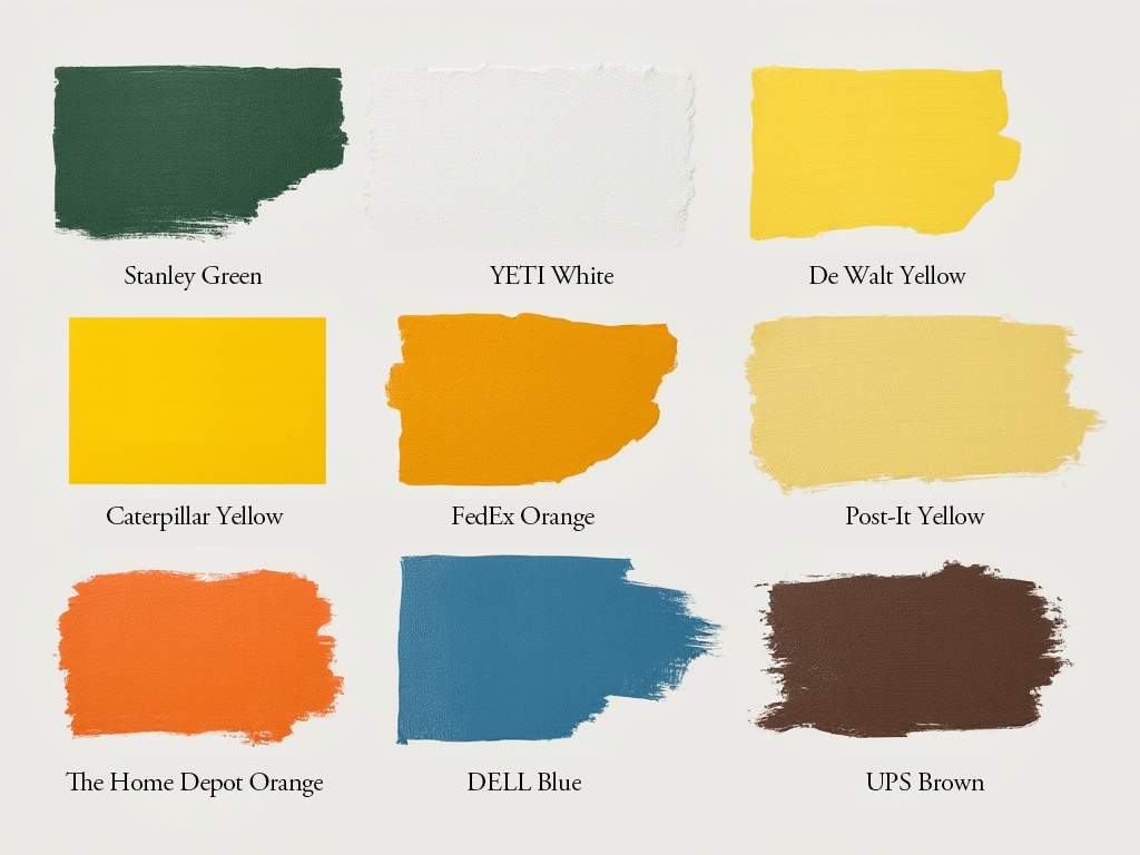
A couple weeks ago I talked about Stanley’s iconic hammered green finish.
That industrial heritage color launched a brand that’s evolved dramatically — kids now hunt for Stanley cups in “Peony Pink” (or “Barbie Pink” if they can find it) and dozens of other colors. But that original green created the foundation for what Stanley could become.
Interestingly, color choices often start with function, not fashion.
Take Yeti. Their signature white coolers weren’t that way for style. Yeti founders Roy and Ryan Seiders started with white because as boaters, they needed a cooler that wouldn’t absorb heat on sun-baked decks. When hunters joined their target market, they added tan to blend into natural environments.
Function led to recognition. Recognition built identity.
UPS chose brown in 1916 because it hid dirt well on trucks and uniforms. Now it’s impossible to imagine their trucks any other color.
(Where I Live, UPS drivers often wear their brown shorts in the open-cab vans long into winter. One day I’ll research that phenemenon…)
DeWalt’s bright safety yellow (#FEBD17) stands out in dusty job sites, while Caterpillar’s slightly more orange-tinted yellow (PMS 1235C) maximizes heavy equipment visibility in construction environments. Each owns their specific shade.
Sometimes accidents create icons. Post-it’s canary yellow (#FFE44D) exists because the lab only had yellow scrap paper for prototypes. The color worked so perfectly they kept it.
(In I Need That, I note how Post-it’s present purpose was serendipitous. There’s a brand that has bumbled its way to the top!)
My personal fave color story? Tiffany Blue. They’ve used that distinctive robin’s egg shade since the 1800s, choosing it because turquoise jewelry was popular with Victorian brides. It’s now Pantone 1837 (their founding year) and has been trademarked since 1998.
Even luxury brands can stumble into color success. When Hermès ran out of the usual beige boxes during WWII, they had to buy the only color available — their now-signature orange.
Funny how the most successful product colors often began with practical purpose or happy accident, then evolved into powerful brand assets. I suspect there’s some magic in that connectivity.
Smart product makers understand this marriage of function and identity.
Action for you: Look at your category’s color conventions. Map out who owns what colors, and where the gaps might be. Test some unexpected color options with your ideal users. Pretend you’re stuck with them, and see where it goes!
Laurier
P.S. John Deere has only protected their specific green since 2010, but they’ve used it since their first self-polisher in 1905. My farmer grandpa’s combines and my dentist grandpa’s snowmobile were that color. It’s a color connection that runs deep for me, despite being a city boy.
